NotificationConfig Android only
classNotificationConfig
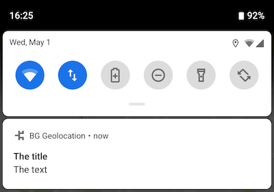
Foreground service notification configuration for the background geolocation SDK.
Android requires a persistent notification whenever the SDK runs its foreground
service. NotificationConfig controls that notification's content, appearance,
and behaviour while tracking is active.
Contents
Overview
Configure this via NotificationConfig on AppConfig.notification.
| Category | Properties | Notes |
|---|---|---|
| Content | title, text, color |
Notification text and accent color. |
| Icons | smallIcon, largeIcon |
Resource references in type/name format. |
| Channel | channelName, channelId |
Android O+ notification channel settings. |
| Behaviour | sticky, priority |
Persistence and ordering. |
| Custom layout | layout, strings, actions |
Custom XML layout with text fields and buttons. |
// Within a coroutine scope
val bgGeo = BGGeo.instance

bgGeo.ready {
    // Notification config is managed via the Android notification builder
    // or through the config.app namespace.
}

// Update notification fields at runtime.
bgGeo.config.edit {
    // Notification title/text are configured via Android's
    // foreground service notification builder pattern.
}
Custom layout
Supply a custom Android Layout XML file via NotificationConfig.layout for complete control over the notification appearance.
See the Android Custom Notification Layout guide for full setup instructions.
Members
actions
Declare click listeners for <Button /> elements of a custom notification layout.
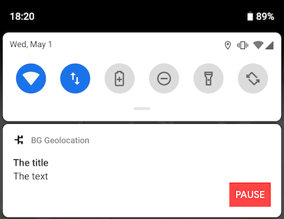
See Android Custom Notification Layout for setup instructions.
Declare <Button /> elements in your layout XML, then list their android:id values
in the actions array to register click listeners.
Custom <Button /> element
<Button
  android:id="@+id/notificationButtonPause"
  style="@style/Widget.AppCompat.Button.Small"
  android:layout_width="60dp"
  android:layout_height="40dp"
  android:text="Foo" />
// Within a coroutine scope
val bgGeo = BGGeo.instance

bgGeo.ready {
    app.notification.actions = listOf(
        "notificationButtonPause"   // <-- register button listeners
    )
}

// Listen to custom button clicks:
bgGeo.onNotificationAction { buttonId ->
    when (buttonId) {
        "notificationButtonPause" -> bgGeo.changePace(false)
        // ...
    }
}
channelId
Identifier of the Android notification channel used for the foreground service
notification. Defaults to "bggeo".
Note
Changing this is not typically required. A use case is sharing an existing notification channel with another foreground service in the same app.
channelName
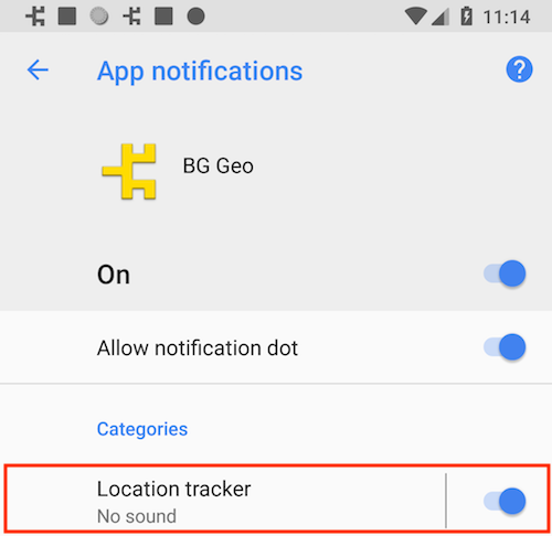
Name of the Android notification channel used for the foreground service notification.
Defaults to "BackgroundGeolocation".
On Android O and above, foreground services require a notification channel. The channel name is visible to users under:
Settings → Apps & Notifications → Your App
// Within a coroutine scope
val bgGeo = BGGeo.instance

bgGeo.ready {
    app.notification.channelName = "Location Tracker"
}

// Update at runtime
bgGeo.config.edit {
    app.notification.channelName = "My new channel name"
}
color
Accent color of the notification icon. Not set by default.
Applies to API level 21 and above. Supported formats:
- #RRGGBB
- #AARRGGBB
largeIcon
Large icon for the foreground notification. Not set by default.
Warning
- Specify the resource type (
drawableormipmap) followed by the icon name in the formattype/icon_name. - Do not include the file extension (e.g.
.png).
See also
- smallIcon
// Within a coroutine scope
val bgGeo = BGGeo.instance

bgGeo.ready {
    // drawable resource
    app.notification.largeIcon = "drawable/my_notification_large_icon"
    // or a mipmap resource:
    // app.notification.largeIcon = "mipmap/my_notification_large_icon"
}
layout
Name of a custom Android Layout XML file for the foreground notification.
See also - Android Custom Notification Layout
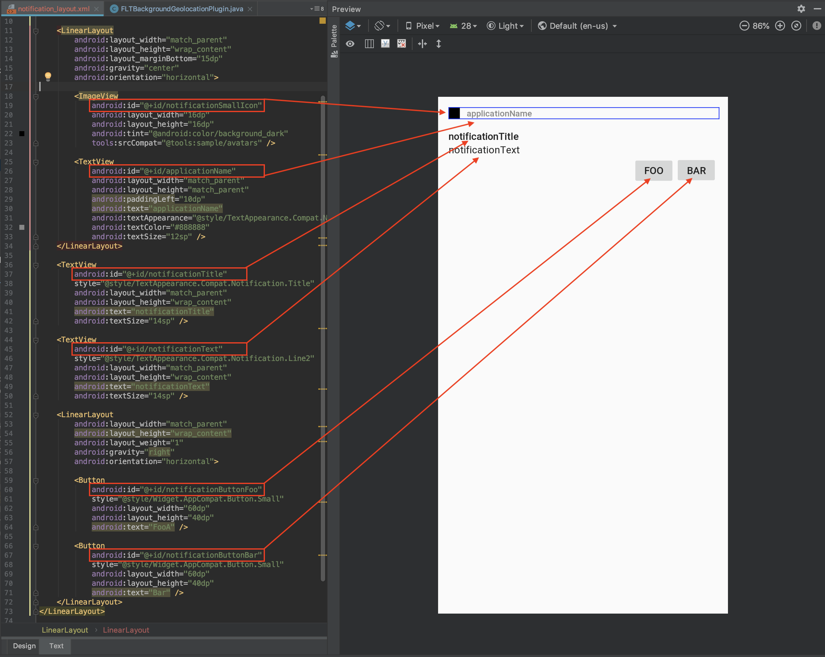
Custom layouts support <TextView />, <ImageView />, and <Button /> elements.
The SDK fills the special elements below by their fixed android:id. Your own
elements may use any android:id: you reference it from strings or
actions.
Layout special elements
When rendering a custom notification, the SDK searches for the following IDs and populates them from the associated data source:
Layout element android:id |
Data source |
|---|---|
applicationName |
Application name from AndroidManifest |
notificationTitle |
title |
notificationText |
text |
notificationSmallIcon |
smallIcon |
notificationLargeIcon |
largeIcon |
// Within a coroutine scope
val bgGeo = BGGeo.instance

bgGeo.ready {
    app.notification.layout = "my_notification_layout"  // res/layout/my_notification_layout.xml
    app.notification.title = "The Notification Title"
    app.notification.text = "The Notification Text"
    app.notification.smallIcon = "mipmap/my_small_icon"
    app.notification.largeIcon = "mipmap/my_large_icon"
}
Custom <TextView /> elements
You may define your own custom text fields and populate them using
strings.
// Within a coroutine scope
val bgGeo = BGGeo.instance

bgGeo.ready {
    app.notification.strings = mapOf(
        "myCustomElement" to "My Custom Element Text"
    )
}
Custom <Button /> elements
Define your own buttons and register click listeners using
actions.
// Within a coroutine scope
val bgGeo = BGGeo.instance

bgGeo.ready {
    app.notification.actions = listOf(
        "notificationButtonFoo",
        "notificationButtonBar"
    )
}

bgGeo.onNotificationAction { buttonId ->
    println("[onNotificationAction] $buttonId")
    when (buttonId) {
        "notificationButtonFoo" -> {
            // Handle [Foo]
        }
        "notificationButtonBar" -> {
            // Handle [Bar]
        }
    }
}
Sample layout
<?xml version="1.0" encoding="utf-8"?>
<LinearLayout xmlns:android="http://schemas.android.com/apk/res/android"
    xmlns:tools="http://schemas.android.com/tools"
    android:layout_width="match_parent"
    android:layout_height="135dp"
    android:gravity="start"
    android:orientation="vertical"
    android:padding="15dp">

    <LinearLayout
        android:layout_width="match_parent"
        android:layout_height="wrap_content"
        android:layout_marginBottom="15dp"
        android:gravity="center"
        android:orientation="horizontal">

        <ImageView
            android:id="@+id/notificationSmallIcon"
            android:layout_width="16dp"
            android:layout_height="16dp"
            android:tint="@android:color/background_dark"
            tools:srcCompat="@tools:sample/avatars" />

        <TextView
            android:id="@+id/applicationName"
            android:layout_width="match_parent"
            android:layout_height="match_parent"
            android:paddingLeft="10dp"
            android:text="applicationName"
            android:textAppearance="@style/TextAppearance.Compat.Notification.Title"
            android:textColor="#888888"
            android:textSize="12sp" />
    </LinearLayout>

    <TextView
        android:id="@+id/notificationTitle"
        style="@style/TextAppearance.Compat.Notification.Title"
        android:layout_width="match_parent"
        android:layout_height="wrap_content"
        android:text="notificationTitle"
        android:textSize="14sp" />

    <TextView
        android:id="@+id/notificationText"
        style="@style/TextAppearance.Compat.Notification.Line2"
        android:layout_width="match_parent"
        android:layout_height="wrap_content"
        android:text="notificationText"
        android:textSize="14sp" />

    <LinearLayout
        android:layout_width="match_parent"
        android:layout_height="wrap_content"
        android:gravity="right"
        android:orientation="horizontal">

        <TextView
            android:id="@+id/myCustomElement"
            style="@style/TextAppearance.Compat.Notification.Line2"
            android:layout_width="0dp"
            android:layout_height="wrap_content"
            android:layout_gravity="center_vertical"
            android:layout_weight="1"
            android:text="myCustomElement"
            android:textSize="12sp" />

        <Button
            android:id="@+id/notificationButtonFoo"
            style="@style/Widget.AppCompat.Button.Small"
            android:layout_width="60dp"
            android:layout_height="40dp"
            android:text="FooA" />

        <Button
            android:id="@+id/notificationButtonBar"
            style="@style/Widget.AppCompat.Button.Small"
            android:layout_width="60dp"
            android:layout_height="40dp"
            android:text="Bar" />
    </LinearLayout>
</LinearLayout>
priority
val priority:NotificationPriority
Controls the position and visibility of the foreground notification in the system
shade. Defaults to PRIORITY_LOW (-1).
priority affects both the ordering of the notification in the notification shade
and the position/visibility of the small status-bar icon.
| Value | Description |
|---|---|
| NotificationPriority.Default | Weighted toward the top; status-bar icon left-aligned. |
| NotificationPriority.High | Strongly weighted to the top; icon strongly left-aligned. |
| NotificationPriority.Low | Weighted toward the bottom; icon right-aligned. |
| NotificationPriority.Max | Equivalent to NOTIFICATION_PRIORITY_HIGH. |
| NotificationPriority.Min | Strongly weighted to the bottom; icon hidden. |
// Within a coroutine scope
val bgGeo = BGGeo.instance

bgGeo.ready {
    app.notification.priority = NotificationPriority.HIGH
}
smallIcon
Small status-bar icon for the foreground notification. Defaults to
"mipmap/ic_launcher" (the app launcher icon).
Warning
- Specify the resource type (
drawableormipmap) followed by the icon name in the formattype/icon_name. - Do not include the file extension (e.g.
.png).
See also
- largeIcon
// Within a coroutine scope
val bgGeo = BGGeo.instance

bgGeo.ready {
    // drawable resource
    app.notification.smallIcon = "drawable/my_notification_icon"
    // or a mipmap resource:
    // app.notification.smallIcon = "mipmap/my_notification_icon"
}
sticky
Keeps the foreground service notification visible at all times, regardless of
motion state. Defaults to false.
By default the notification is shown only while the SDK detects the device is
moving. Set to true to show the notification continuously — for example, when
full transparency to users is a requirement.
strings
Custom strings to render into <TextView /> elements of a custom notification layout.
See Android Custom Notification Layout for setup instructions.
Declare your own <TextView /> elements in the layout XML and populate them by
supplying matching key/value pairs in strings, where the key matches the
android:id of the element.
<TextView
  android:id="@+id/myCustomElement"
  android:layout_width="match_parent"
  android:layout_height="wrap_content"
  android:text="notificationTitle" />
// Within a coroutine scope
val bgGeo = BGGeo.instance

bgGeo.ready {
    app.notification.strings = mapOf(
        "myCustomElement" to "My Custom Element Text"
    )
}
text
Body text of the foreground service notification. Defaults to "Tracking location".
title
Title of the foreground service notification. Defaults to "Background Geolocation".